Digital & Print Seating Charts
Translating a massive physical space into a detailed digital representation is not just a technical delivery challenge, but an opportunity for planning and research to guide the way to success.
This case study explores the balance between solving broad user problems and diving into the smallest imaginable details. The result: a picture perfect representation of a physical space that is not only accurate, but helps 300,000+ people/year navigate complex problems.
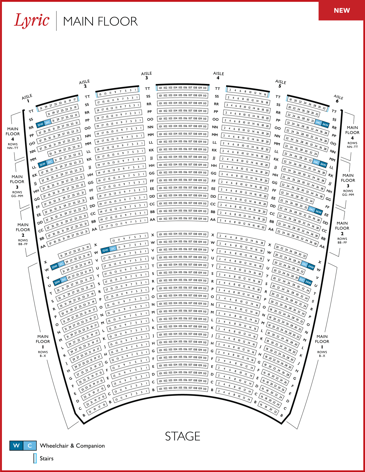
Lyric Opera of Chicago is one of the leading opera companies in the United States. As their sole designer, I completely redesigned their print and digital theater maps to facilitate hundreds of thousands of ticket sales each year.
Complete redesign of 3,652-seat theater maps utilized by over 300,000 patrons per year:
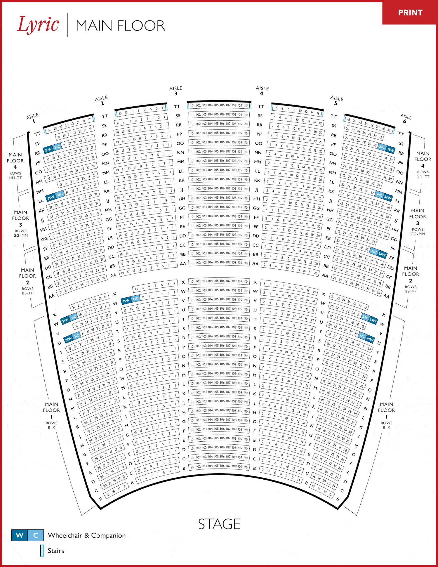
Print: 8.5x11", available as PDF for Lyric's website and used in ticketing office
Web: Interactive Map for eCommerce Platform
5 months
I led all stages of this project from research to final execution. Some highlights:
Both the print and digital maps were very well-received by both patrons and Lyric employees.
Patrons now have a more accurate understanding of Lyric's theater and can purchase tickets more easily. Employees now have a more helpful guide when assisting patrons.
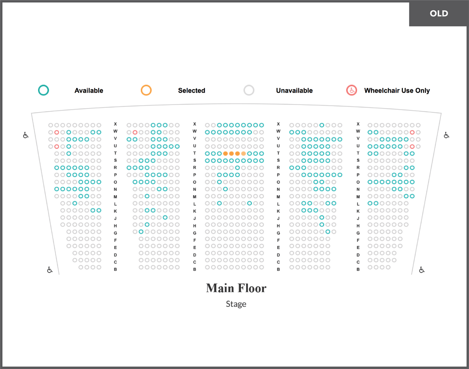
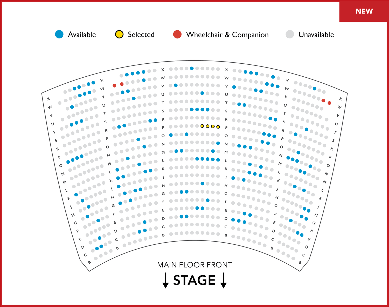
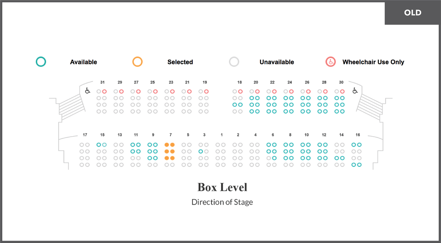
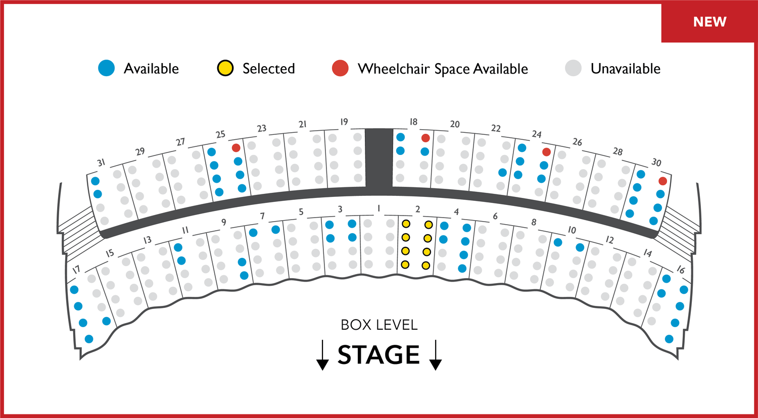
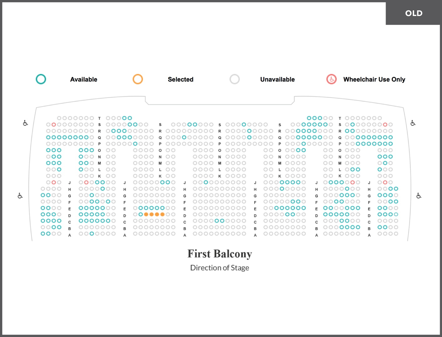
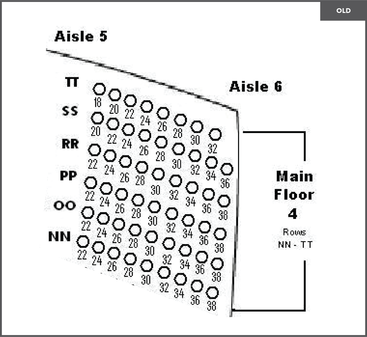
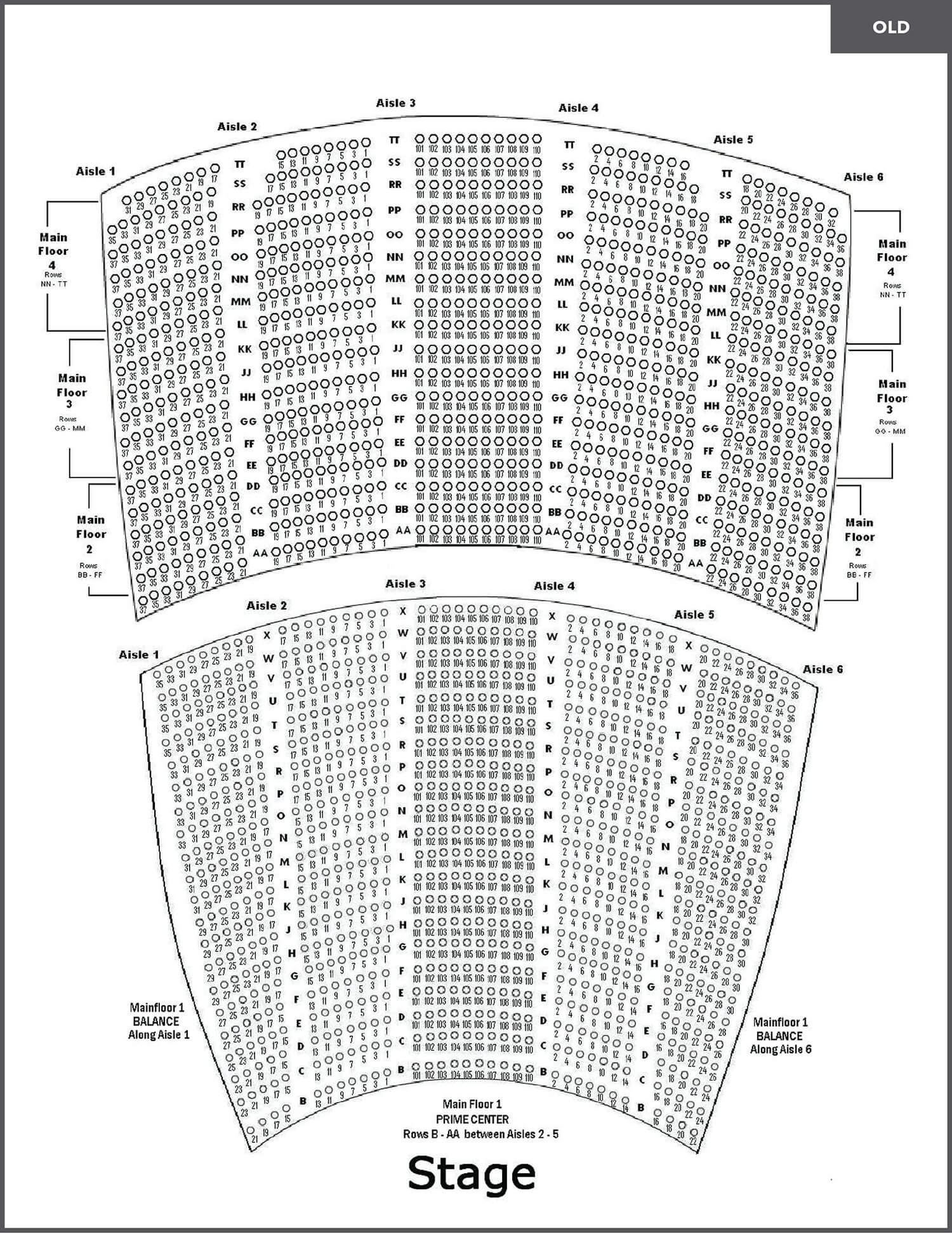
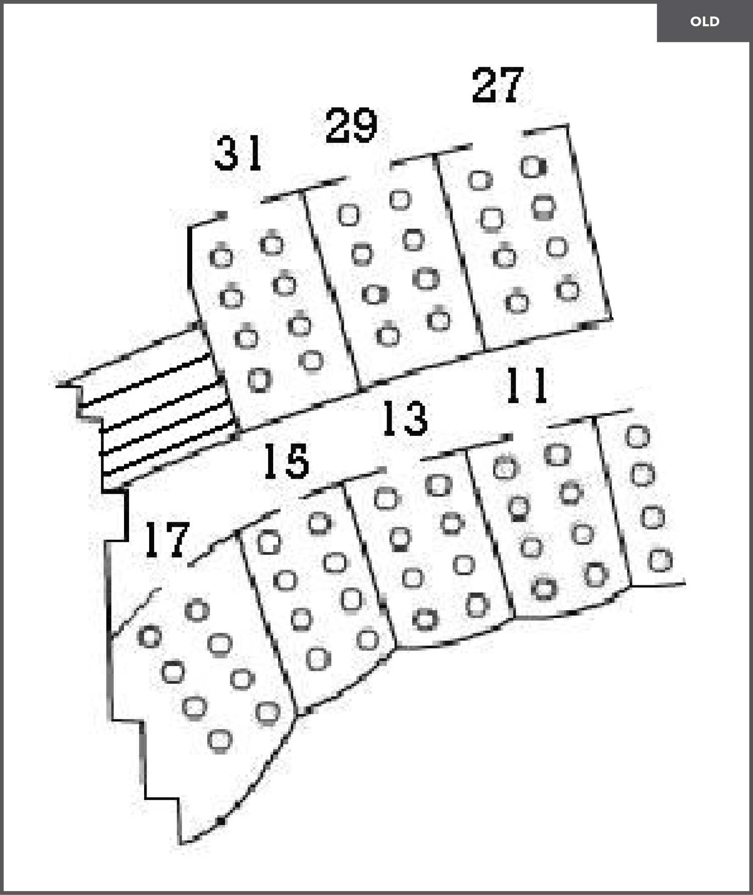
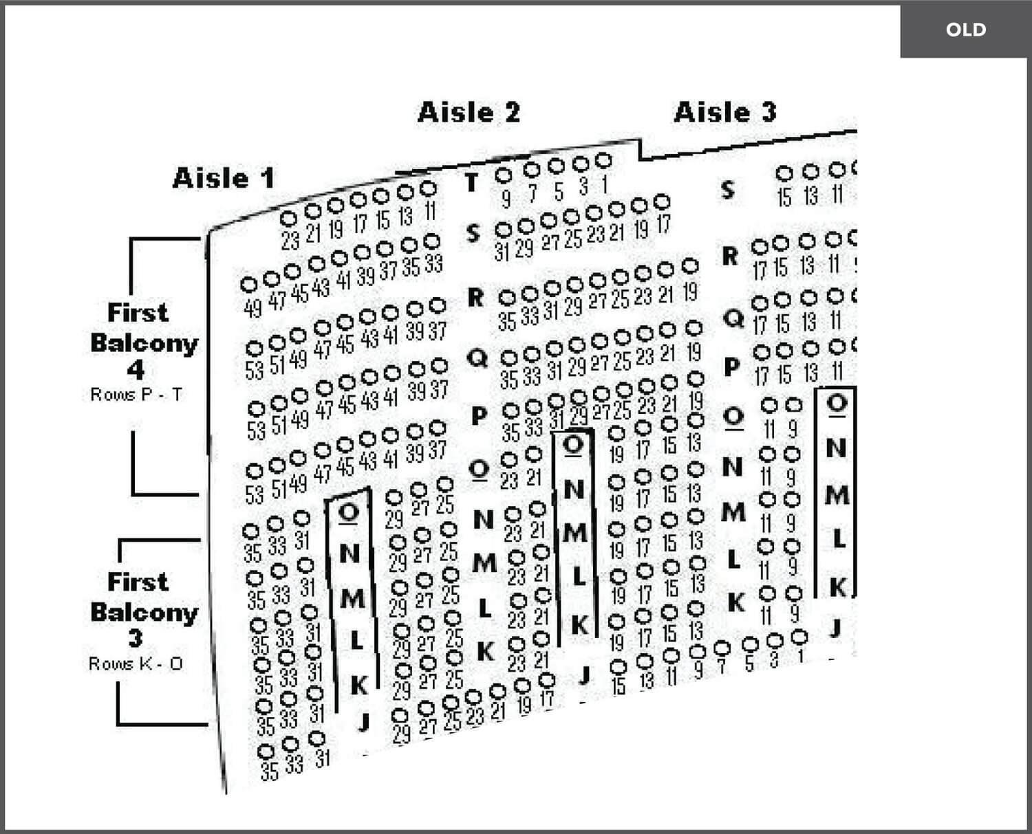
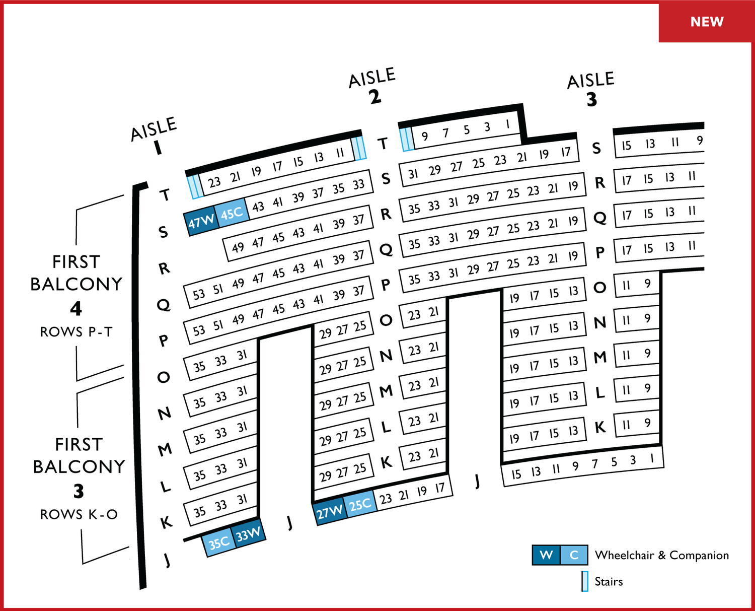
Lyric's previous printed seating chart was low-fidelity, difficult to navigate, cluttered, inaccurate and did not reflect their world-class brand. It also lacked information about accessibility.
I led the effort to address these concerns.
With the success of the printed map, I was asked to redesign the interactive online map used for purchasing tickets.
I used a similar approach to Phase 1 to execute this redesign, addressing many of the same issues of legibility, accessibility, and visual balance.
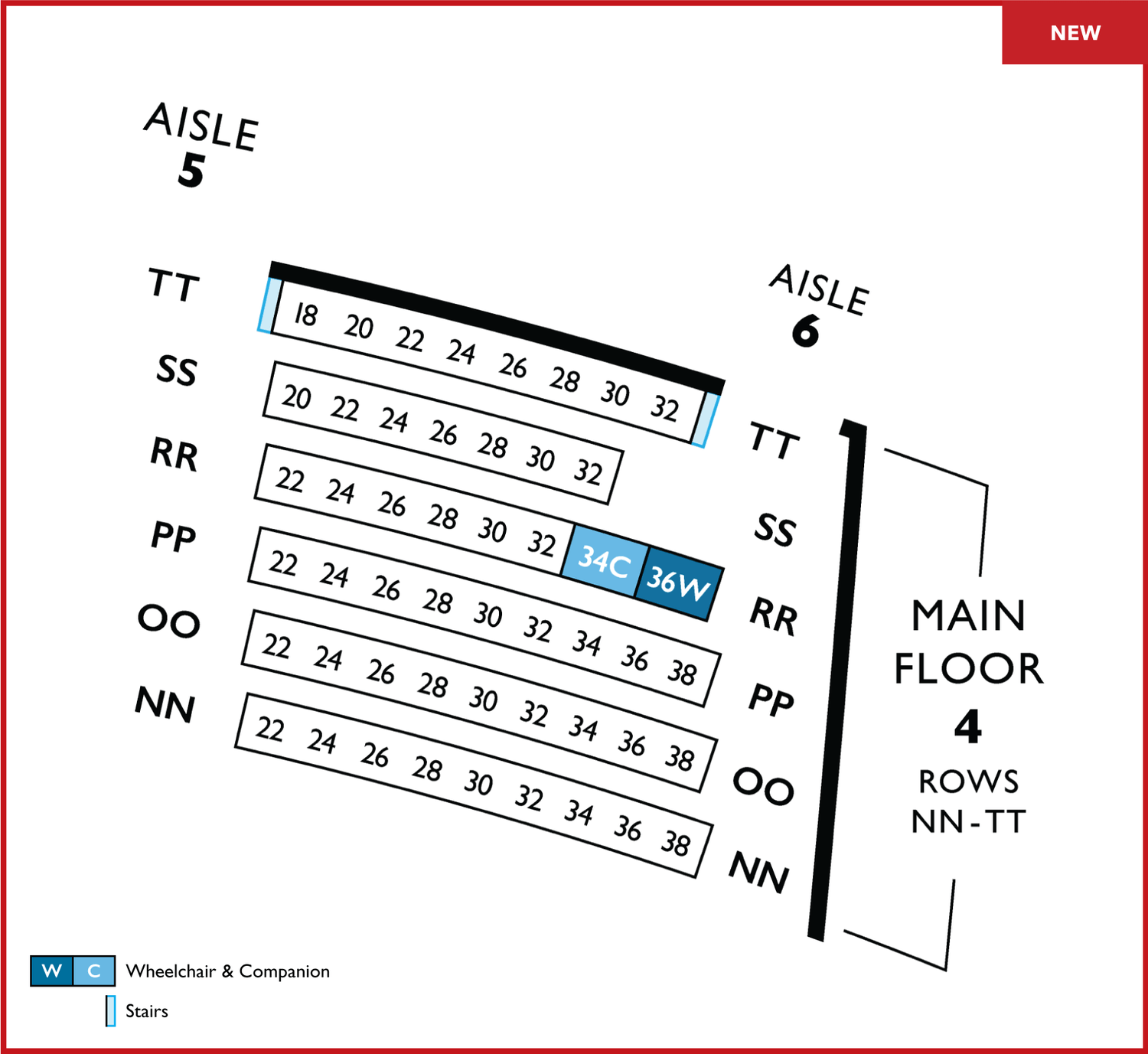
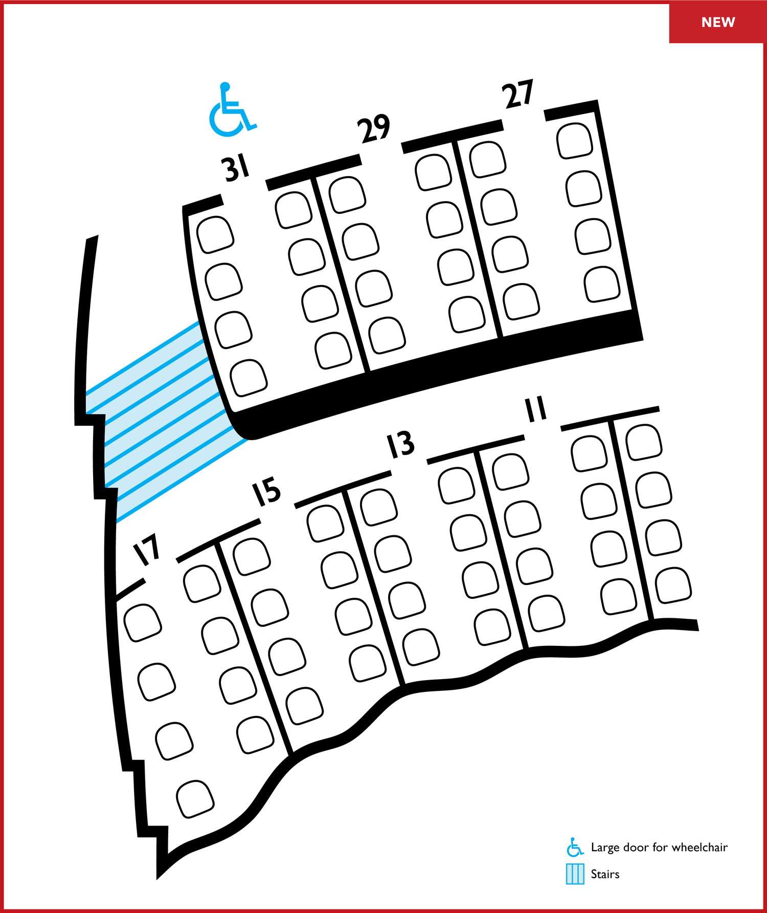
To achieve legibility while fitting Lyric's numerous seats onto an 8.5x11"-sized paper, I mainly addressed spacing and text size. Through A/B testing, I figured out the minimum legible point size in order to maximize the amount of space I could create in between and around the text.
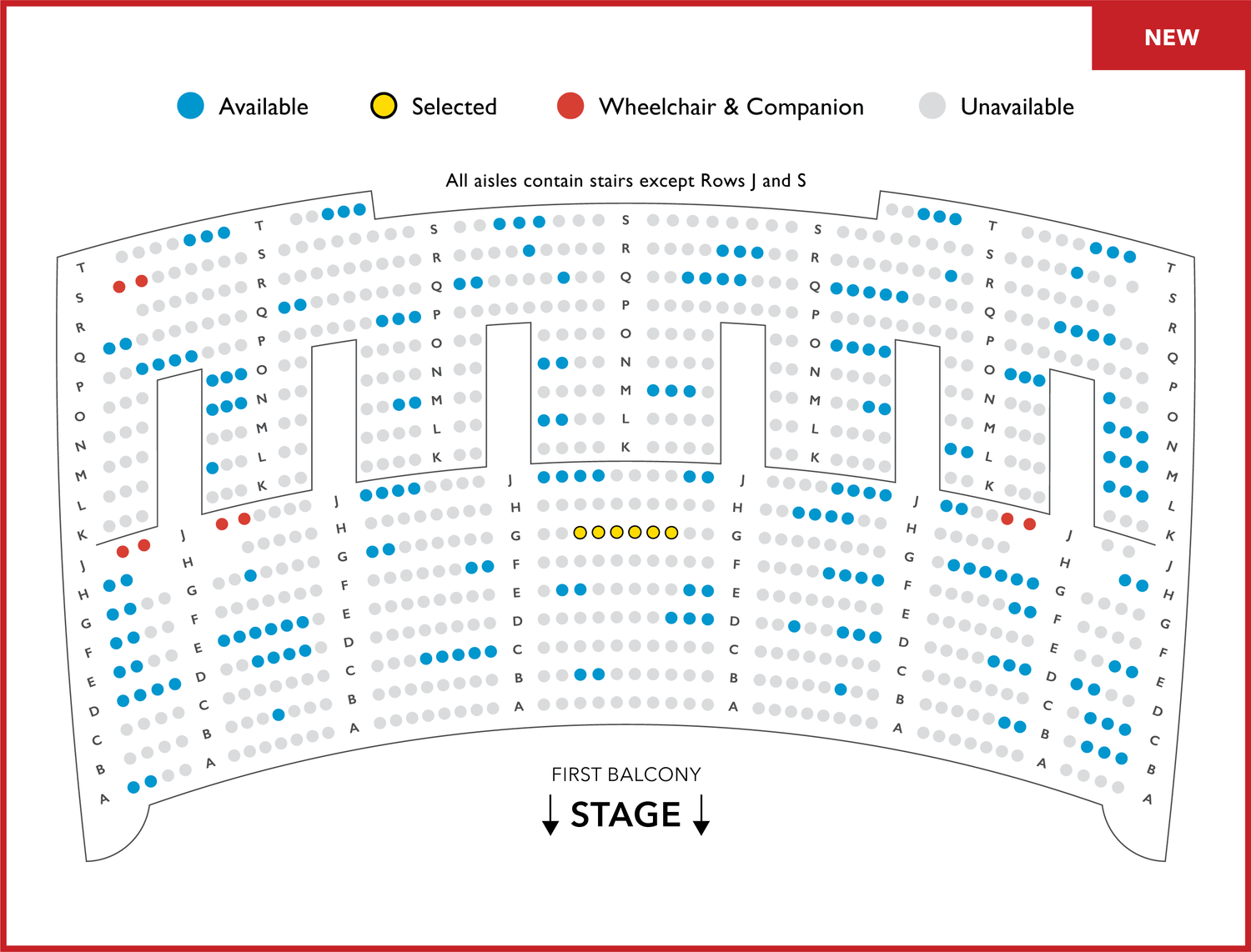
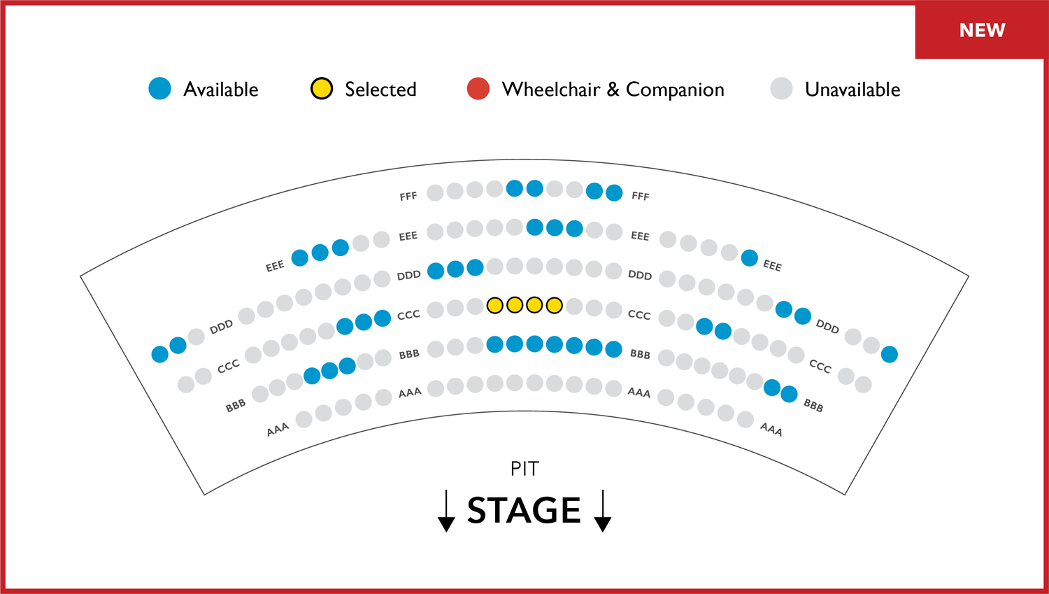
The previous map lacked wheelchair accessible seats and stairs. Since a wheelchair icon would have been too small, I used color to mark wheelchair and companion seats. I also indicated how many stairs are in the last row of the Main Floor, First Balcony, and Upper Balcony.
I set up guides to ensure consistent sizing and spacing of all rows, aisles, and text between every level of the map.
I was asked to mark clear and accurate boundaries to help patrons understand where they can travel.
I based the new online map on the new print map, achieving the same level of accuracy and balance.