UX Research for Desktop & Mobile App
Research is often rushed and undervalued. Sometimes it's skipped completely.
What happens when we take the time to truly understand a product landscape before diving into designing a single feature?
While I am a full-time product designer, I have an extensive background in music performance and composition. I've used many music notation products myself and I felt there was opportunity for improvement. I was curious to gain a more comprehensive understanding of the product lanscape from the music community. This led to a survey of 275 musicians to learn about the the most popular music notation products, their strengths, and their shortcomings.
1 month
The research confirmed my hypothesis that there is room for improvement among current offerings. After gaining insights from users and conducting my own usability tests, I was able to identify the strengths and weaknesses of existing products. From there, I compiled a comprehensive list of user-centered UX requirements for a music notation product that empowers both new and experienced users.
I designed the survey to be partially quantitative, but mostly qualitative. I also had two sets of questions: one for users with any amount of experience with music notation products, and one for users with zero experience. Here's what I was hoping to learn specifically:
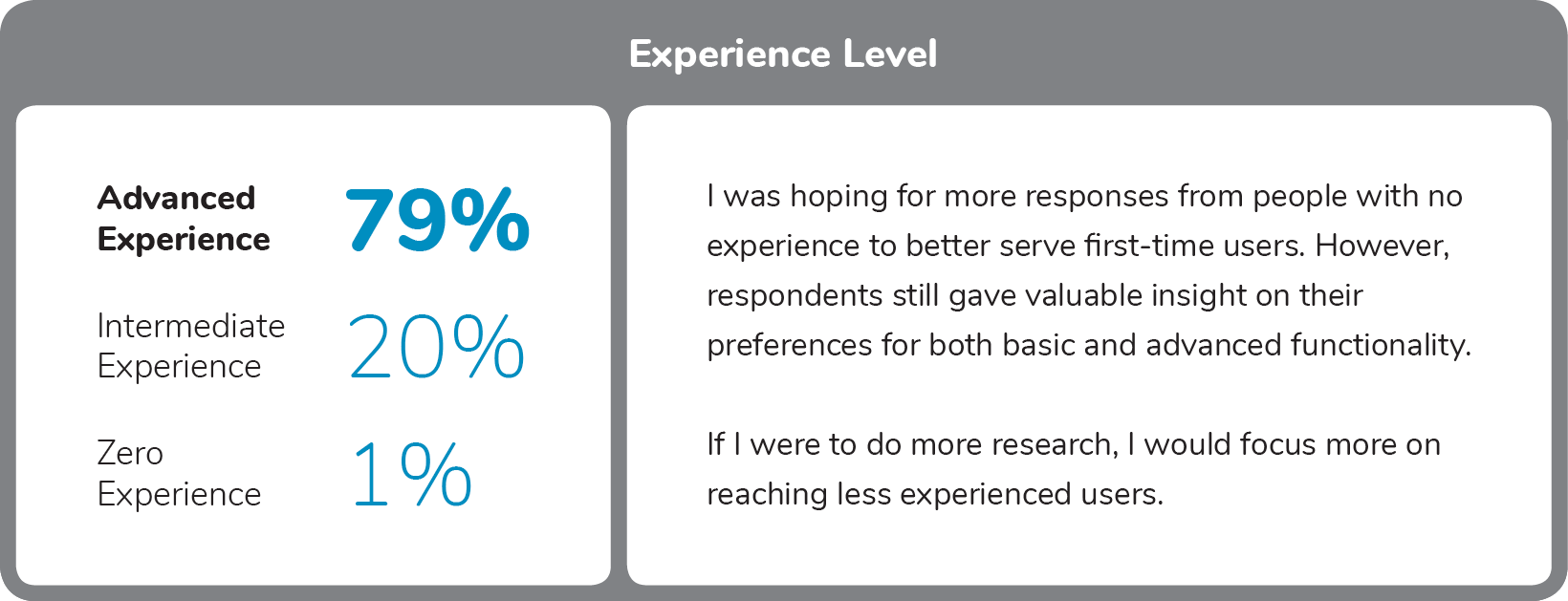
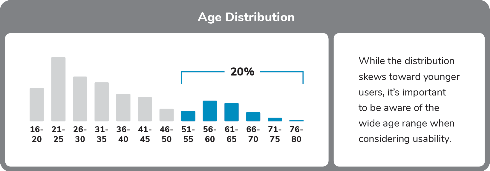
275 people responded, providing insights on 13 different music notation platforms. The respondents described themselves as composers, performers, educators, students, music enthusiasts, and more — the first hint regarding how many different use cases must be covered.


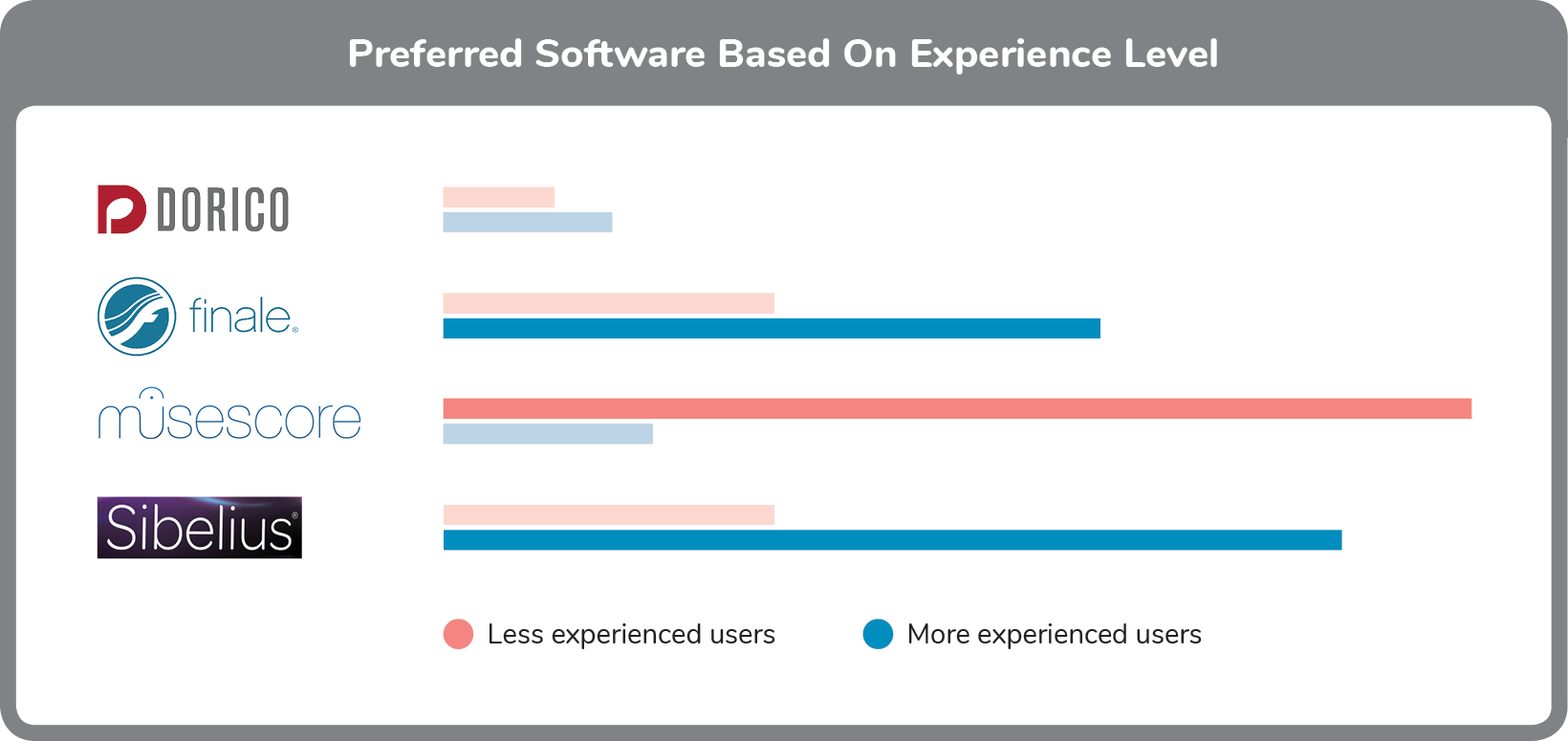
Out of 13 products users mentioned as their primary music notation software, 89% use one of the four below. I noticed that preferences among the four change drastically based on experience level:

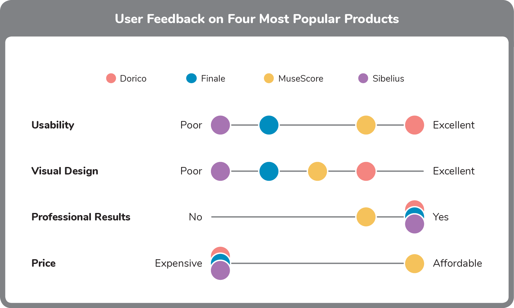
Less experienced users prefer MuseScore. This is partially due to its low price point (free!) and relatively intuitive interface.
More experienced users prefer Finale and Sibelius. While both are almost $600 and do not have intuitive interfaces, they offer more features than MuseScore.
Dorico, priced similarly to Finale and Sibelius, was actually the best-rated but the least-used of the four, partially due to its recent 2016 release date. Finale and Sibelius have been available for much longer (1988 and 1993, respectively). Many long-time users of Finale/Sibelius expressed they are not willing to switch to any new software unless it's exponentially easier to use.

While very few users use the following products, I did learn something interesting while researching each one that aided in creating the final UX requirements and thinking about design solutions.
Open source text-based notation that separates input from output. While very powerful, it has an almost impossibly-steep learning curve for anyone not familiar with programming.
Dorico actually implements some text-based commands, but in a more visual way that experienced users find useful. I think there is room to improve that functionality and make it more accessible for users of all experience levels.
Free/affordable online platform. Simple to use, but lacks important features and results don't look professional. Performance also struggles because it's a web app.
While some users did express interest in an online platform, it does not seem a viable option at this time because of poor performance.
Music notation for guitar specifically. Guitars use special notation that is not found on all general-purpose notation products.
More specialized products like this serve as a valuable guide for how to implement specialized functionality into more general-purpose product.
Respondents revealed what excites and frustrates them most and gave suggestions for desired features. Based on that, here are some of the main issues music notation products need to address:
Intuitive enough for new users to learn the basics, robust enough for experienced users to write extremely complex music.
While notation products often offer complex functionality, finding and implementing what you need should be easy for every user.
The ability to adjust every visual detail of the music. Like any form of visual design, this is to serve both aesthetics and functionality. Ultimately, sheet music is created for a musician to read musical ideas with ease.
Users rely on playback features to hear their creations before giving them to actual musicians. This means automatic playback as well as the ability to customize how the software interprets the music.
It is currently very difficult for a visually impaired person to use notation products.
Users with more experience look for features that makes their workflow as fast as possible.
A simplified app that lets users write music on the go - similar to a sketchpad for visual artists. This would serve as a complement to a full-featured desktop app, not a replacement.
No single program can account for every type of music notation, so users need the ability to import/create their own custom solutions.
Support for MusicXML - an open format to represent music notation - to share music between different applications. This is crucial for collaboration.
I specifically limited the scope of this project to research, to focus on user needs and define requirements completely agnostic of a solution.
I've found that research is often rushed and undervalued, and this project shows how many insights can be uncovered when we take the time to talk to people and make connections that aren't always obvious at first.